
The silent filter every prospect runs
Before anyone books a call with you, they search your name. This is not speculation — it is standard behaviour among every category of senior professional and corporate buyer. What they find in that moment is either a reason to continue or a quiet reason to move on. Most consultants assume their website is neutral. It is not. A site that looks dated, generic, or misaligned with the seniority of the work you do sends a signal. It says the person behind it either does not take their own positioning seriously or has not updated their digital presence since they were building their career rather than running it.
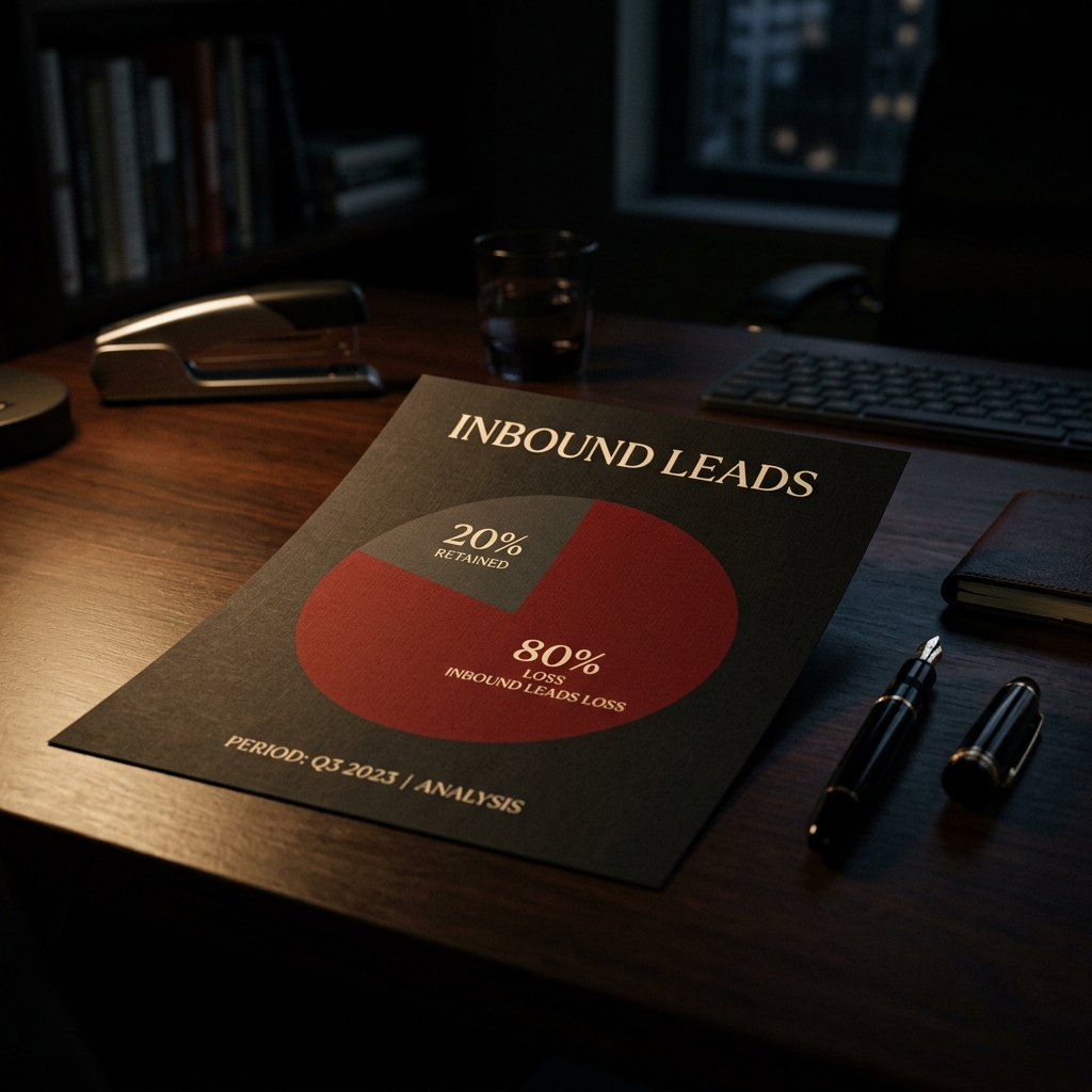
What a weak website actually costs
The cost is not visible. Nobody emails to say your website put them off. They simply do not reach out. The deal goes to someone else. The referral does not convert. You never know what you lost. For a consultant charging $5,000 to $15,000 a month per engagement, one missed client per quarter is a significant number. Two or three per year is a serious problem. The website is rarely framed as a revenue problem, but that is exactly what it is.
What prospects are actually looking for
They are not looking for flashy design. Senior buyers are looking for three things: clarity about what you do and who you do it for, evidence that you have done it before at the right level, and enough professionalism in the presentation to feel comfortable recommending you to their board or their peers. A site that delivers those three things in the first 30 seconds does its job. Most consulting websites fail on all three.
The fix is simpler than most people think
You do not need a 20-page website. You need a clear positioning statement, two or three outcome-focused case studies or project descriptions, a simple about section that reads like a capable person wrote it rather than a CV template, and a frictionless way to get in touch. That is it. The difference between a website that loses clients and one that converts them is not complexity. It is clarity.